Nammos
Taking delivery to new heights
NAMMOS
Brand Identity Designer
Brand identity, Logo design, Brand guidelines
UAE
2024
A category most customers have never used, and no visual language to explain it.
Nammos is a UAE drone delivery startup set on reshaping logistics with autonomous aircraft — faster routes, lower emissions, and a way of receiving a parcel that most people have never experienced.
The brand had to do something unusual: read as technically credible and trustworthy at the same time, without tipping into science fiction. People do not hand their groceries to something that looks like a prop.
Two ideas resolved into one symbol.
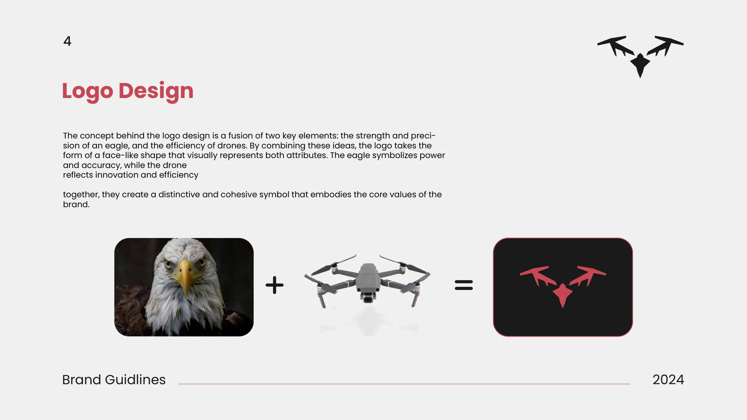
The mark fuses the precision of an eagle with the geometry of a drone. The eagle carries power and accuracy; the drone carries innovation and efficiency. Together they settle into a single face-like form that reads as both and as neither.
It is the kind of construction that only works if it resolves — a bird with rotors bolted on would be a joke. The test was whether someone could read it as one thing before they read it as two.
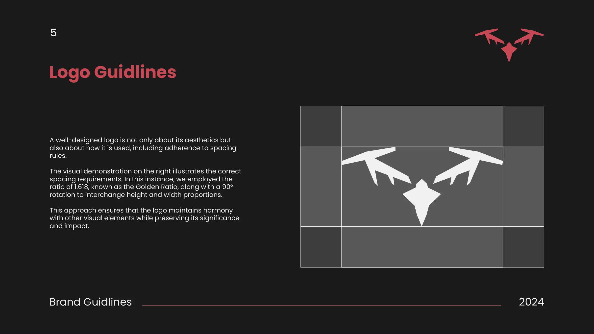
Built on a 1.618 grid, with a 90° rotation governing its proportions.
The construction and clear-space rules sit on the golden ratio, with a 90° rotation interchanging the height and width proportions. The result is a mark that keeps its relationships intact next to other elements, at any size.
What the mark may become, and what it may not.
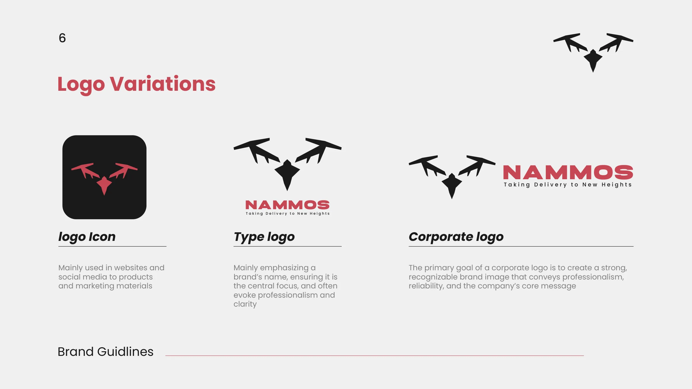
The system specifies the icon for web and social, the full lockup for products and marketing, and the constraints that hold across both. The misuse page is the half that gets skipped and the half that matters: do not distort, do not rotate, do not overlap.
A near-black ground, a signal red, and four colours held in reserve.
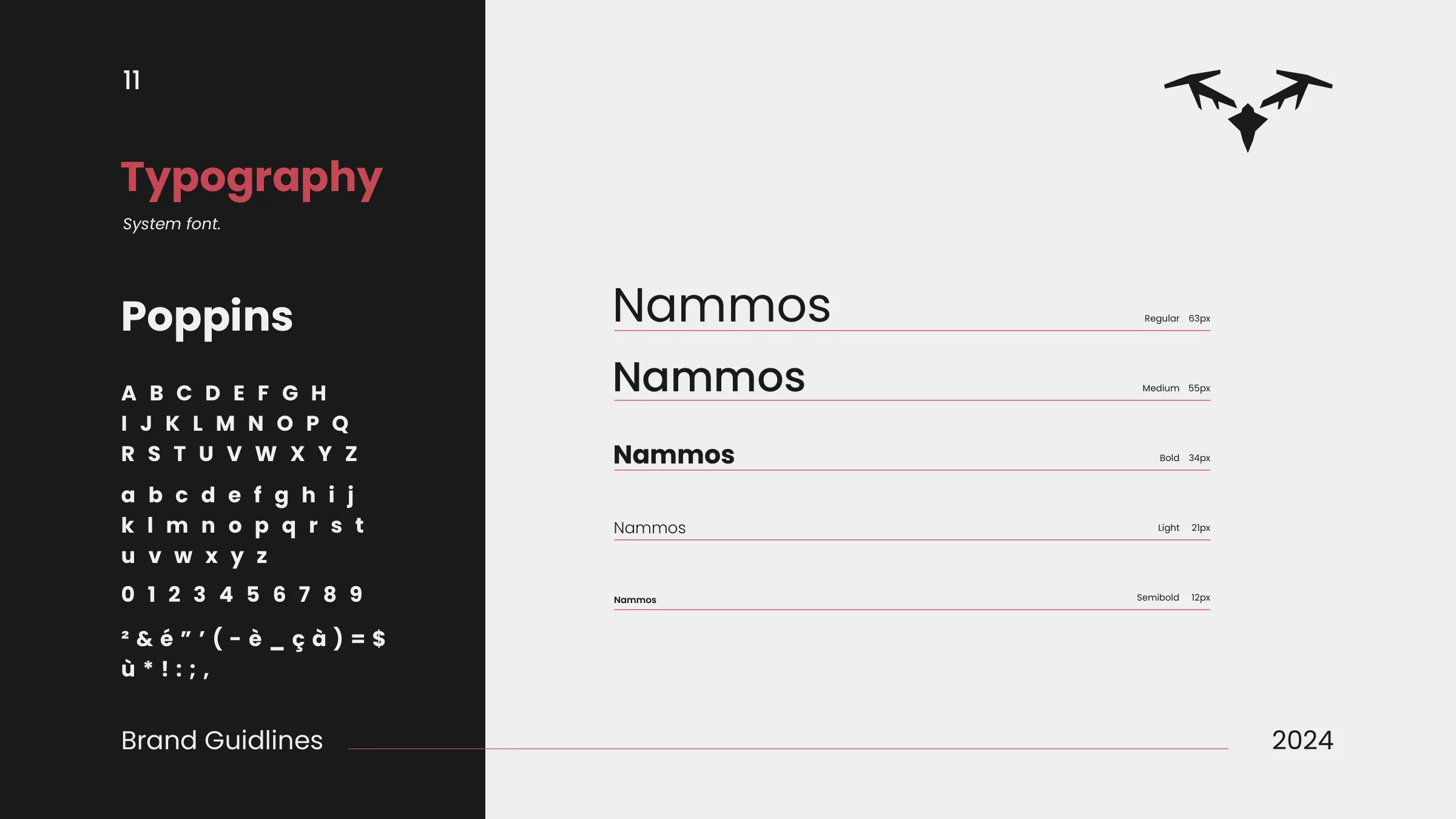
Near-black and off-white form the ground, with a single signal red carrying the mark. Petrol blue, purple and green sit in reserve for secondary use. Legacy Caster is the display face; Poppins runs across five weights for interface and body text.
The brand specified for interface as well as print.
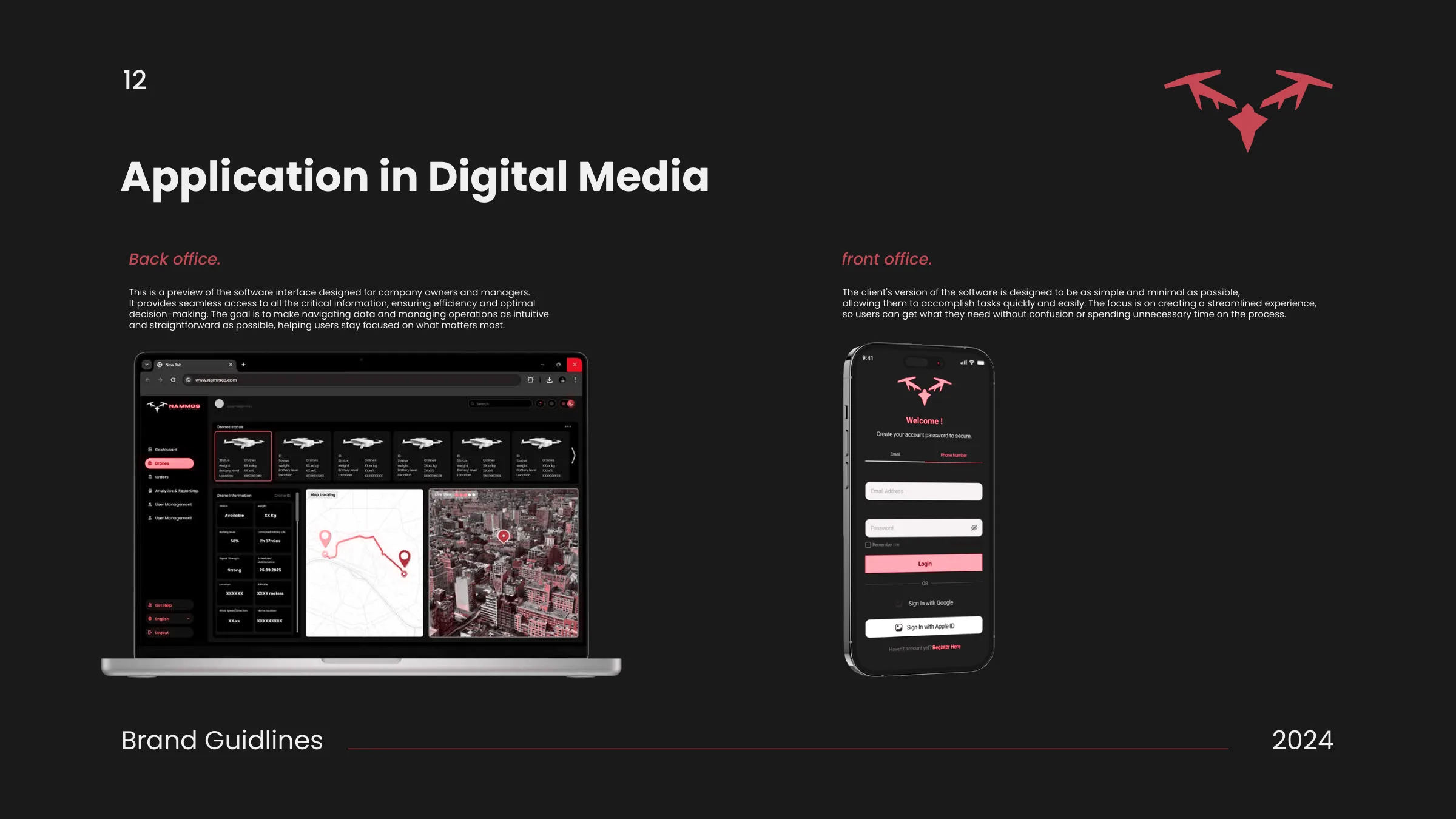
The guidelines mock up how the system behaves on screen — an operator dashboard and a customer-facing app — so the brand was specified for interface as well as for packaging and livery.
This is brand application, not product design. The screens exist to show the system working under constraints a print page never imposes.