VERTX
Crafting success, reflecting worldly innovation
VERTX
Brand Identity Designer
Brand identity, Design system, Brand guidelines
Morocco
Ongoing since 2022
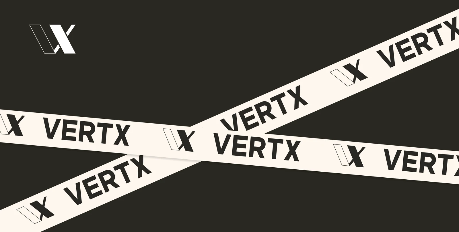
One identity had to carry three service lines without fragmenting.
VERTX is a Moroccan technology company working across software as a service, data engineering and digital marketing. It needed an identity precise enough to sit in front of enterprise clients, and a system complete enough that three distinct service lines could share it without drifting apart.
The deliverable was never a logo. It was a thirty-page system covering identity, colour, type, elements and application — documented so it could be applied by people who were not in the room when it was designed.
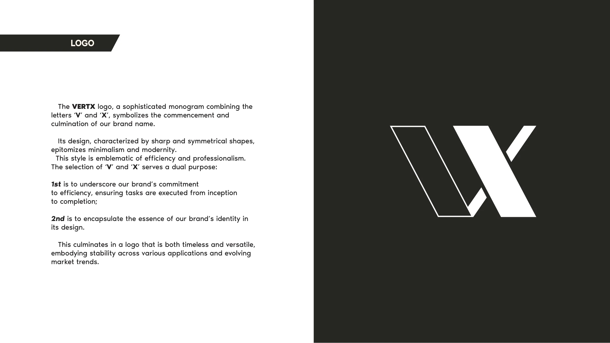
A monogram of the first and last letters of the name.
V and X — the commencement and the culmination of the word. The choice is not decorative: it stands for work carried from inception to completion, which is what the company sells.
It is the kind of reasoning that has to survive being explained to a board, which is why the guide argues it rather than asserting it.
One mark, both grounds.
The full lockup pairs the monogram with the wordmark and the three values the company sells on. It ships in two cuts — one for light grounds, one for dark — because a brand that only works on white is a brand that stops working the moment it leaves the deck.


Primary lockup, light and dark cuts
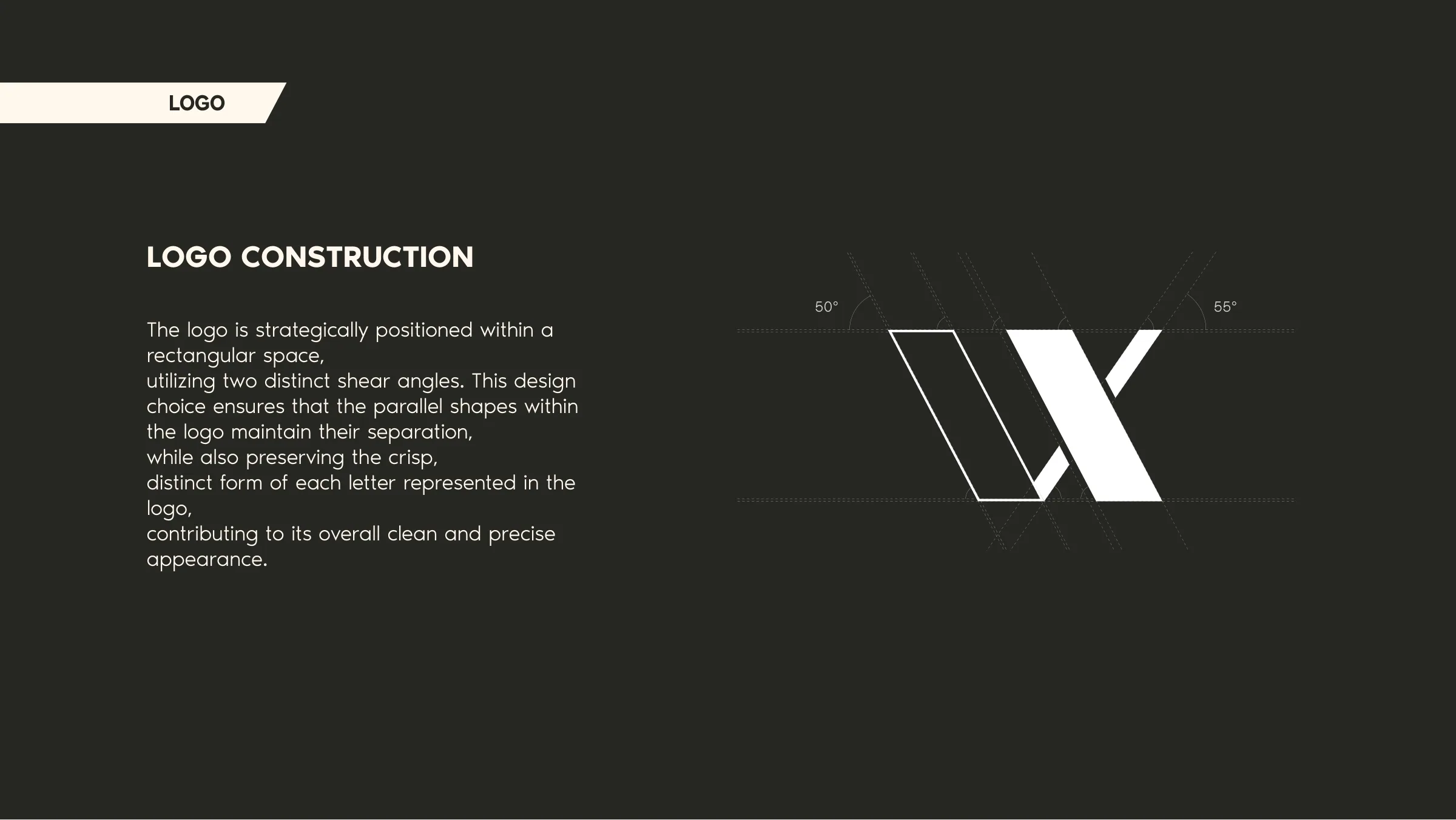
Two shear angles, and spacing derived from the mark itself.
The monogram is built on two distinct shear angles, 55° and 50°. They keep the parallel forms separated and each letter distinct, so it survives being reduced to a favicon or enlarged across a building.
The clear-space rule takes the width of a shape inside the mark as its unit. Because the measure comes from the mark, the spacing scales with it — the rule holds at any size without anyone recalculating it.
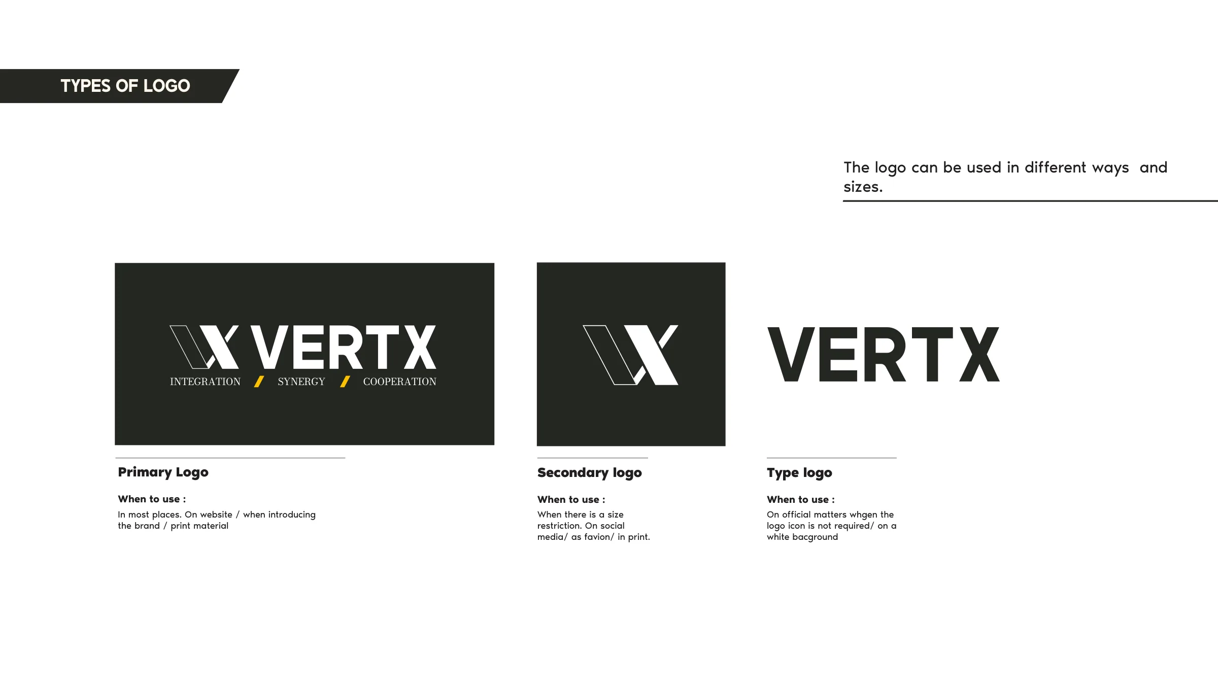
Primary, secondary, and type-only — each with a rule for when to use it.
The primary lockup carries the monogram, the wordmark and the three values beneath it. The secondary drops to the monogram and wordmark for size-constrained placements and social avatars. The type-only form exists for official documents and white grounds where the icon is not required.
Specifying when each is used matters more than drawing them. It is the difference between a set of files and a system.
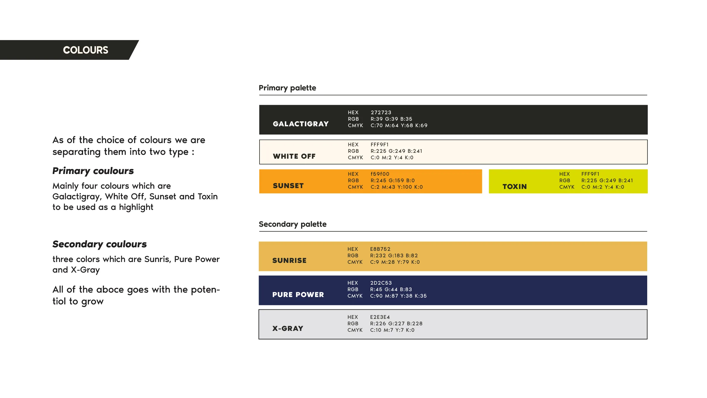
Seven colours, and one assigned to each service line.
Galactigray, White Off, Sunset and Toxin form the primary palette, with Sunrise, Pure Power and X-Gray secondary. Backgrounds sit in Galactigray; Toxin green is reserved for highlight.
Each of the three service lines — software as a service, data engineering, digital marketing — carries its own colour from the system. The company can speak as three practices without becoming three brands.
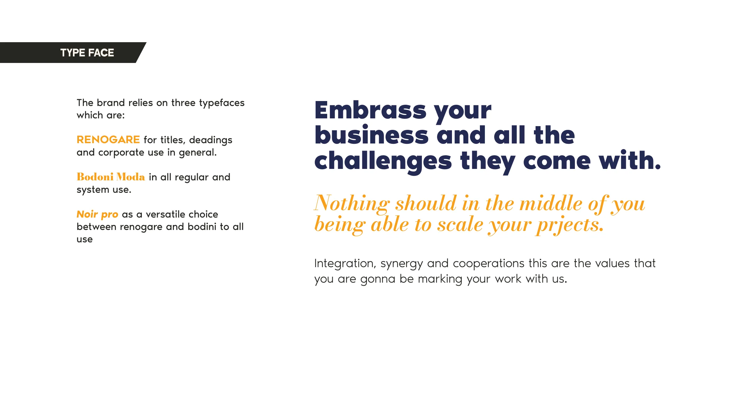
Three faces, each with a job.
Renogare for titles, headings and corporate use. Bodoni Moda for regular and system setting. Noir Pro as the versatile middle ground between them, documented across a full type scale.
Icons drawn from the logo, not alongside it.
The icon set is derived from the shapes already in the monogram rather than drawn separately, so the elements and the mark share a geometry instead of merely coexisting. Photography is specified as black and white, to contrast with the bright silhouettes the brand uses.
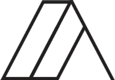
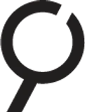
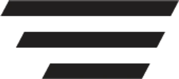

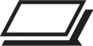

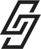
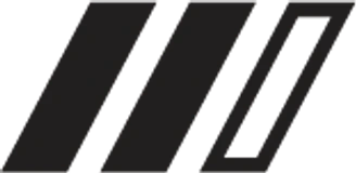
The icon set, drawn from the monogram geometry
Proportions precise enough that a layout comes out right first time.
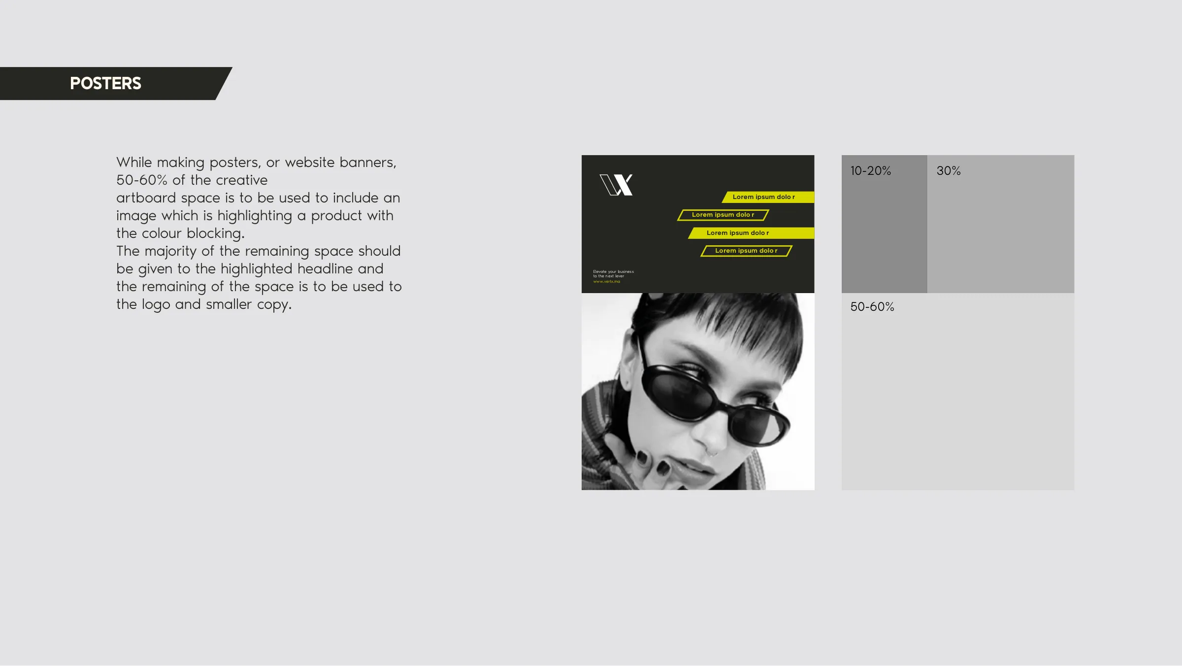
For posters and web banners, 50–60% of the artboard goes to image, the majority of the remainder to the highlighted headline, and what is left to the mark and supporting copy.
A proportion is a more useful instruction than an example. It tells someone what to do with a format nobody anticipated.